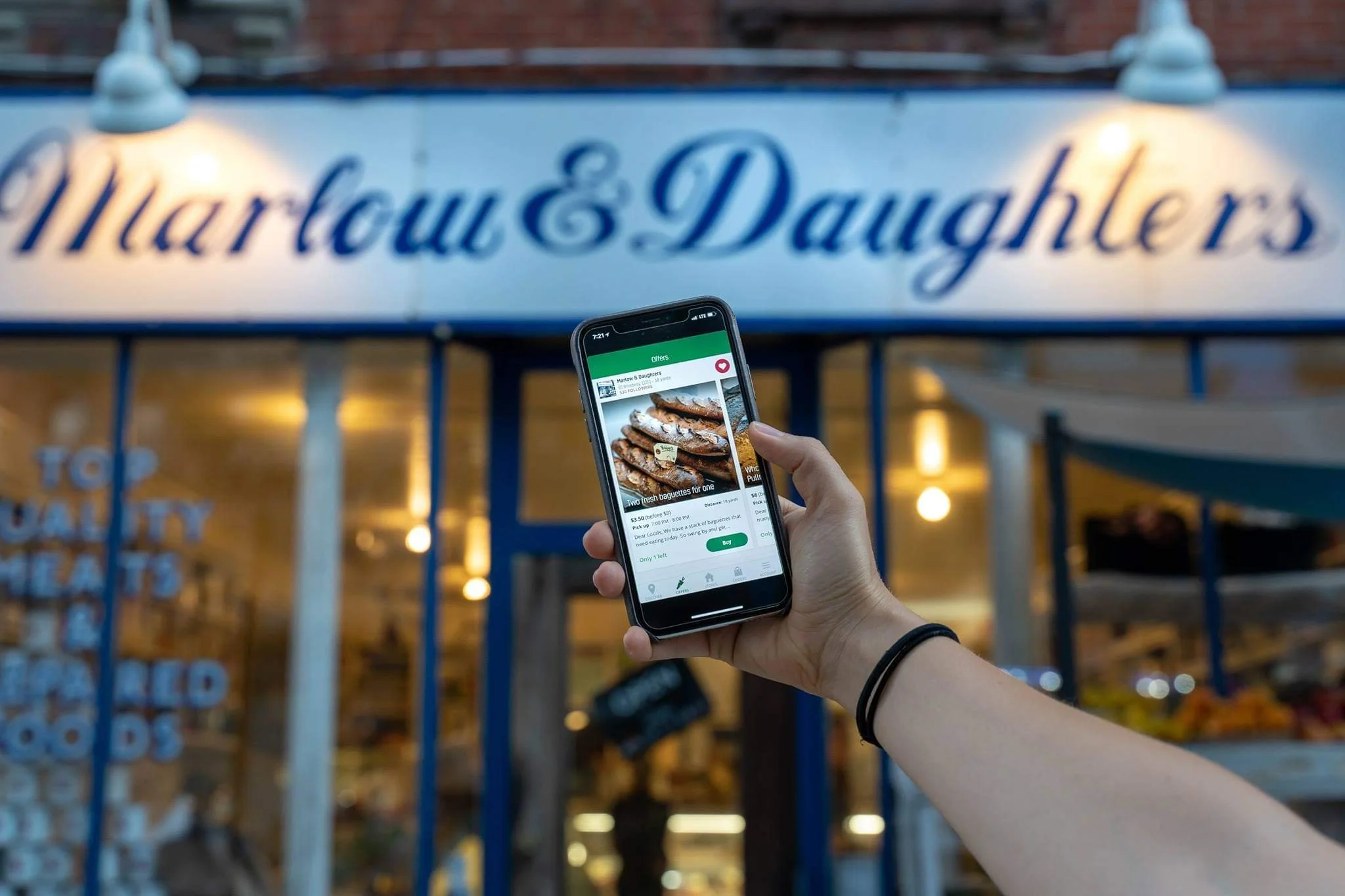
YourLocal
Save Money.
Save Food.
Save the Planet.
Save Money. Save Food. Save the Planet.
The Brief
What is our goal?
Our team optimized the YourLocal mobile app through a partial redesign. Keeping YourLocal’s core values in mind, we upgraded features that we identified as problem areas through various types of testing and analysis. Our goal was to help create a Minimum Viable Product (MVP) that could:
Better cater to users’ needs
Facilitate overall business growth
Increase sales
Who is YourLocal?
YourLocal is a social enterprise that helps locals save money and reduce food surplus with their favorite neighborhood shops and restaurants. Their target audience is young professionals and college students. At its core, YourLocal promotes sustainability by putting a positive spin on selling discounted food items that would have otherwise been discarded by the restaurants.
Who is our audience?
Our primary user group was working professionals between the ages of 28-35 years old and were predominantly women. They were looking to:
(1) access high quality meals at a discounted price
(2) be part of the solution combating food waste
There was also a secondary user group of college students looking to save money on meals. The YourLocal team sourced existing users for us to interview for research purposes.
Domain Research & Competitive Analysis
The market for discount food purchase and sustainability apps currently include GoMKT, Karma, Too Good To Go, Food For All, OLIO, and MealPal. We compared some target user metrics:
Noteworthy Features & Insights
Allowing users to visualize their pickup route through a map (GoMKT)
Gamifying the user’s sustainability impact into badges and stats makes the app more interactive (Karma)
Allowing the user to rate past order experiences lets them know that their input is valued (MealPal)
Giving users encouragement in empty states to start making an impact motivates them (Olio)
Robust filter systems to allow user to see items based on their dietary preferences (Karma, FoodForAll)
Map view/list view toggle gives users the choice to see options in both views (MealPal, Karma)
3. User Research
The client sourced 8 current users of the app for our team to interview.
Hearing from our users:
First, we established what drove our users to make purchases. We found that there were 4 main decision factors.
Next, we established motivations, usage patterns, and existing pain points. Our goal was to identify which features we could improve or create in order to facilitate usage.
4. Problem Statement
Who are our designs targeting? What do they need? Why do they need it?
5. Constraints
Prioritization Activity
Based on the findings from the user research interviews, we compiled a journey map with positive and negative user experience quotes that spanned from the initial sign up to post purchase. During the sprint 2 meeting, we asked our clients to place user quotes from the journey map that reflects their frustrations and confusions on a prioritization matrix. We expected to narrow down and find some directions for the concepts we were creating.
Ultimately, given the time and resource constraints and immediate needs of the client, we decided to chunk the concepts into 3 groups—Now, Next, and Later. This was intended to give the client a roadmap of flows that we would be working on and other flows that could be improved in the future once they gather more resources.
6. Wireframing & Prototyping
Using Invision, we created a prototype and had 10 users test out the mid-fidelity prototype. Users were asked to perform three tasks:
Leave a review on previous orders.
Find a new deal
Redeem their impact coins for a code and get a reward meal
After gathering their feedback and discovering some usability problems, we iterated several screens to achieve the final mid-fidelity prototype.
Browsing & Filtering
Reviewing Past Orders
Favorites, Map View, & Account Page
Optimized Flow: Redeeming Points and Applying Promo Codes
7. Handoff & Reflections
We provided the client with the following items to ensure that the development team could pick up where we left off:
As the 3 weeks came to an end, I realized there were a few unique lessons I’d take away from this project as a designer:


